Open Sans Font: Complete Guide to Free Download and Usage
Open Sans is one of the most popular and versatile humanist sans-serif typefaces available today. Designed by Steve Matteson and commissioned by Google, this font has become a favorite among web designers and developers for its exceptional readability and clean, modern appearance. This comprehensive guide will show you everything about open sans font download and how to implement it effectively in your design projects.
What is Open Sans Font?
Open Sans is a humanist sans-serif typeface designed specifically for digital interfaces and print materials. Released in 2011 as part of Google Fonts, it was created with the goal of providing optimal legibility across all screen sizes and resolutions. The font features friendly, open forms with excellent clarity that makes it perfect for both body text and display applications.
The design is characterized by its upright stress, open apertures, and neutral yet friendly appearance. These features make Open Sans highly readable at small sizes while maintaining visual interest in larger display applications. Its humanist characteristics give it warmth and approachability, distinguishing it from more mechanical geometric sans-serifs.
Why Choose Open Sans Font?
Exceptional Readability
Open Sans was specifically designed for on-screen reading, making it one of the most legible fonts available for digital applications. Its wide apertures and clear letterforms ensure that text remains readable even at small sizes on low-resolution screens.
Complete Font Family
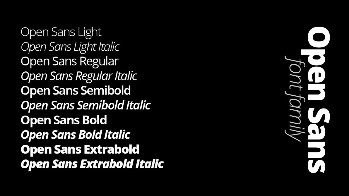
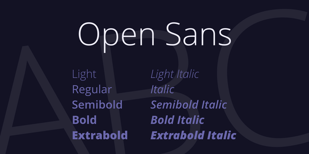
The open sans font free download includes a comprehensive family of weights and styles:
- Light (300): Elegant weight for large text and headlines
- Regular (400): Perfect for body text and general use
- Semi Bold (600): Ideal for subheadings and emphasis
- Bold (700): Strong weight for headlines and important elements
- Extra Bold (800): Maximum impact for key messages
Each weight includes both regular and italic variants, providing 10 total styles. This family offers enough variety to create clear typographic hierarchies while maintaining visual consistency throughout your designs.
Versatile and Professional
Open Sans works beautifully across various design contexts, from corporate websites and mobile apps to editorial layouts and presentations. Its neutral character makes it suitable for nearly any brand or message.
Free and Widely Supported
Licensed under the Apache License 2.0, Open Sans is completely free for personal and commercial use. Being part of Google Fonts means excellent browser support and reliable long-term availability.
How to Download Open Sans Font
Download from Google Fonts
The simplest method to obtain Open Sans is through Google Fonts:
- Navigate to the Google Fonts website
- Search for "Open Sans" in the font catalog
- Select the weights and styles you need
- Click "Download family" to get the complete font package
- Extract the ZIP file to access the font files
Installing Open Sans on Your Computer
Windows Installation: Right-click the font file (TTF format) and select "Install" or "Install for all users" to make it available system-wide in all applications.
macOS Installation: Double-click the font file to open Font Book, then click "Install Font" to add it to your system fonts collection.
Linux Installation: Copy font files to the ~/.fonts or /usr/share/fonts directory, then run "fc-cache -fv" in terminal to refresh the font cache.
Using Open Sans on Websites
Google Fonts CDN Method
The quickest way to implement Open Sans on your website is using the Google Fonts CDN. Add this code to your HTML head section:
Then apply it in your CSS:
body {
    font-family: 'Open Sans', sans-serif;
    font-size: 16px;
    line-height: 1.6;
}

h1, h2, h3 {
    font-family: 'Open Sans', sans-serif;
    font-weight: 700;
}
Self-Hosting for Performance
For improved loading speeds and greater control, you can self-host Open Sans fonts using @font-face declarations:
@font-face {
    font-family: 'Open Sans';
    src: url('/fonts/OpenSans-Regular.ttf') format('truetype');
    font-weight: 400;
    font-style: normal;
    font-display: swap;
}
Best Practices for Using Open Sans
Selecting Appropriate Weights
Use Light (300) for large display text where you want an elegant, airy appearance. Regular (400) is ideal for all body copy and general content. Semi Bold (600) works excellently for subheadings and navigation. Reserve Bold (700) and Extra Bold (800) for headlines, buttons, and elements requiring strong emphasis.
Optimal Typography Settings
For body text, maintain a font size of 16-18px with line height between 1.5-1.7 for comfortable reading. Ensure adequate letter spacing (0-0.02em) for optimal legibility. For headlines, sizes between 28px and 64px work well depending on hierarchy and context.
Perfect Font Pairings
Open Sans pairs well with various complementary fonts:
- Open Sans + Merriweather (humanist sans with friendly serif)
- Open Sans + Lora (clean sans with elegant serif)
- Open Sans + PT Serif (modern sans with traditional serif)
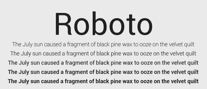
- Open Sans + Roboto Slab (humanist sans with geometric slab)
Color and Contrast
Ensure sufficient contrast between text and background. Target at least 4.5:1 contrast ratio for normal text and 3:1 for large text to meet WCAG accessibility standards. Lighter weights need higher contrast to maintain readability.
Popular Use Cases for Open Sans
Open Sans excels in numerous design applications:
- Website Body Text: Exceptional readability makes it perfect for long-form content
- User Interfaces: Clear letterforms ideal for app interfaces and dashboards
- Corporate Communications: Professional appearance for business documents
- E-commerce Sites: Clean, trustworthy aesthetic for online stores
- Educational Materials: High legibility for learning platforms and textbooks
- Mobile Applications: Optimized for small screens and various resolutions
Open Sans Condensed
For projects requiring space efficiency, Open Sans Condensed offers a narrower alternative. It maintains the same readability while occupying less horizontal space, making it perfect for dense information layouts, navigation menus, and responsive designs.
Performance Optimization Tips
When using Open Sans on websites, optimize for performance:
- Only load the font weights you actually use in your design
- Use font-display: swap to prevent invisible text during loading
- Implement font subsetting to include only necessary characters
- Preload critical fonts to improve initial page rendering speed
- Use WOFF2 format for better compression and faster downloads
- Consider using a CDN for faster global delivery
Conclusion
Open Sans font represents an excellent choice for designers and developers seeking a reliable, readable, and versatile typeface. Its humanist design, comprehensive font family, and free availability make it ideal for projects of any scale. Whether you're designing a website, developing a mobile app, or creating print materials, Open Sans provides the clarity and professionalism you need.
With this guide, you have all the information necessary to download, install, and effectively implement Open Sans in your projects. Its proven track record and widespread adoption ensure that your designs will look professional and remain readable across all devices and platforms. Start using Open Sans today and experience why it has become one of the most beloved fonts in modern design.





.jpg)