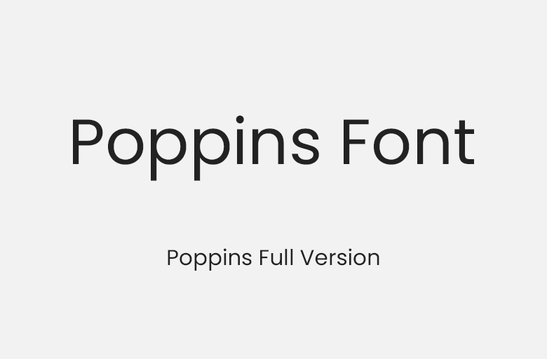
Poppins Font: Your Complete Guide to Free Download and Usage
Poppins is a geometric sans-serif typeface that has become one of the most beloved fonts in modern web design. Created by Indian Type Foundry, this versatile font family combines modern aesthetics with exceptional readability, making it perfect for both digital and print applications. This comprehensive guide will show you everything about poppins font download and how to use it effectively in your projects.
What Makes Poppins Font Special?
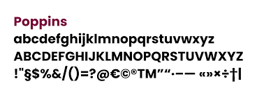
Poppins stands out in the crowded world of typography thanks to its unique geometric design based on pure geometric forms. The font features perfectly circular bowls and near-perfect vertical strokes, creating a clean, modern appearance that works beautifully across all screen sizes and resolutions.
Originally designed to support both Latin and Devanagari scripts, Poppins brings a distinctive international character while maintaining universal appeal. Its name comes from a geometric sans-serif style that emphasizes clarity and contemporary design principles.
The Complete Poppins Font Family
One of the strongest advantages of poppins font free download is its extensive family of weights and styles. The complete family includes:
- Thin (100): Ultra-light for delicate, elegant designs
- Extra Light (200): Subtle weight for refined aesthetics
- Light (300): Perfect for subheadings and secondary text
- Regular (400): Ideal for body copy and general use
- Medium (500): Adds emphasis without being too bold
- Semi Bold (600): Strong presence for important elements
- Bold (700): Powerful weight for headlines and CTAs
- Extra Bold (800): Maximum impact for key messages
- Black (900): Heaviest weight for dramatic effect
Each weight includes both regular and italic variants, giving you 18 different styles to create rich typographic hierarchies and diverse design solutions.
How to Download Poppins Font Free
Download from Google Fonts
The easiest method to get Poppins is through Google Fonts, which offers a straightforward download process:
- Navigate to Google Fonts website
- Search for "Poppins" in the font catalog
- Select the weights you need for your project
- Click "Download family" button
- Extract the ZIP file to access TTF font files
Install on Your Computer
For Windows: Right-click the font file and select "Install" or "Install for all users" to make it available system-wide.
For macOS: Double-click the font file to open Font Book, then click "Install Font" to add it to your system.
For Linux: Copy font files to ~/.fonts or /usr/share/fonts directory and run "fc-cache -fv" to refresh the font cache.
Using Poppins Font on Websites
Google Fonts CDN Method
The quickest way to implement Poppins on your website is using Google Fonts CDN. Simply add this code to your HTML head section:
Then apply it in your CSS:
body {
    font-family: 'Poppins', sans-serif;
}
Self-Hosting for Better Performance
For improved loading speeds and greater control, consider self-hosting Poppins fonts. Download the font files and use @font-face declarations:
@font-face {
    font-family: 'Poppins';
    src: url('/fonts/Poppins-Regular.ttf') format('truetype');
    font-weight: 400;
    font-style: normal;
    font-display: swap;
}
Best Practices for Using Poppins
Selecting Appropriate Weights
Choose lighter weights (100-300) for large display text where elegance is key. Use Regular (400) for body text to ensure comfortable reading. Medium (500) and Semi Bold (600) work excellently for subheadings and navigation elements. Reserve Bold (700) and above for headlines, buttons, and elements requiring strong emphasis.
Optimal Font Sizing
For body text, maintain 16-18px with line height between 1.5-1.7 for optimal readability. Headlines can range from 28px to 80px depending on hierarchy and context. Always test your typography on real devices to ensure it looks crisp and readable.
Perfect Font Pairings
Poppins pairs beautifully with serif fonts for contrast. Consider these combinations:
- Poppins + Merriweather (geometric meets warmth)
- Poppins + Lora (modern sans with elegant serif)
- Poppins + Playfair Display (contemporary meets classical)
- Poppins + Roboto Slab (sans with slab serif companion)
Color and Readability
Ensure sufficient contrast between text and background. Aim for at least 4.5:1 contrast ratio for body text to meet accessibility standards. Lighter weights require even higher contrast to maintain legibility, especially on smaller screens.
Popular Use Cases for Poppins
Poppins has become incredibly popular across various design applications:
- Website Design: Corporate sites, portfolios, landing pages, e-commerce stores
- Mobile Applications: UI design, app interfaces, navigation elements
- Branding: Logos, brand guidelines, marketing materials
- Social Media: Graphics, posts, stories, promotional content
- Print Design: Business cards, brochures, posters, presentations
Why Choose Poppins Font?
Modern and Versatile
Poppins geometric design gives it a contemporary feel that works across industries and design styles. Its clean lines and balanced proportions make it suitable for everything from tech startups to creative agencies.
Excellent Readability
Despite its geometric nature, Poppins maintains excellent readability at all sizes. The carefully crafted letterforms ensure comfortable reading whether used for headlines or body text.
Free and Open Source
Licensed under the Open Font License, Poppins is completely free for both personal and commercial use. This makes it an economical choice for projects of any scale without licensing concerns.
Active Support and Updates
Being part of Google Fonts means Poppins receives ongoing support, regular updates, and guaranteed long-term availability. You can confidently build your brand around this typeface.
Conclusion
Poppins font represents the perfect blend of modern design aesthetics and practical functionality. Its extensive family of weights, excellent readability, and free availability make it an outstanding choice for designers and developers. Whether you're building a website, designing an app, or creating marketing materials, Poppins provides the versatility and quality you need to create professional, eye-catching designs.
Start exploring Poppins today and discover why it has become one of the most popular typefaces in contemporary design. With this guide, you have everything needed to download, install, and effectively implement Poppins in your next project.


.jpg)