Montserrat Font: Complete Guide to Free Download and Usage
Table of Contents
- The Story Behind Montserrat Font
- Why Choose Montserrat Font?
- How to Download Montserrat Font
- Using Montserrat on Websites
- Best Practices for Using Montserrat
- Choosing the Right Weight
- Optimal Typography Settings
- Font Pairing Suggestions
- Accessibility Considerations
- Popular Use Cases
- Montserrat Alternates
- Performance Optimization Tips
- Conclusion
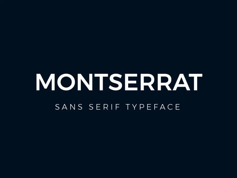
Montserrat is a stunning geometric sans-serif typeface inspired by the urban typography of Buenos Aires. Created by Argentine designer Julieta Ulanovsky, this versatile font has become a designer favorite for its perfect balance of elegance and readability. This comprehensive guide will walk you through everything you need to know about montserrat font download and how to use it effectively in your design projects.
The Story Behind Montserrat Font
Montserrat was born from a desire to rescue the beauty of urban typography that emerged in the first half of the twentieth century in the Montserrat neighborhood of Buenos Aires. Julieta Ulanovsky, who lived in that neighborhood, was inspired by the posters, signs, and painted windows from the 1920s-1940s era.
The font captures the spirit of that bygone era while adapting it for modern digital and print applications. Released in 2011 and continuously refined, Montserrat has grown from a small family to a comprehensive typeface system that rivals commercial fonts in quality and versatility.
Why Choose Montserrat Font?
Timeless Geometric Design
Montserrat features clean geometric forms with a touch of personality that sets it apart from other sans-serif fonts. Its letterforms are carefully balanced between modern minimalism and classic elegance, making it suitable for both contemporary and traditional design contexts.
Extensive Font Family
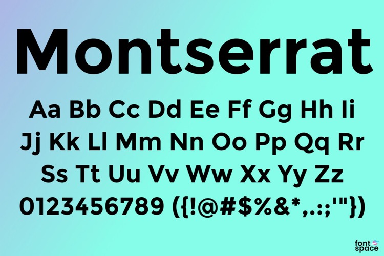
The montserrat font free download includes an impressive range of weights and styles:
- Thin (100): Ultra-light for delicate designs
- Extra Light (200): Subtle weight for refined layouts
- Light (300): Perfect for elegant subheadings
- Regular (400): Ideal for body text
- Medium (500): Balanced emphasis
- Semi Bold (600): Strong without being heavy
- Bold (700): Classic bold for headlines
- Extra Bold (800): Powerful impact
- Black (900): Maximum weight for dramatic effect
Each weight includes both regular and italic variants, providing 18 styles total. This extensive family allows designers to create sophisticated typographic hierarchies within a single font family.
Exceptional Readability
Despite its geometric nature, Montserrat maintains excellent legibility across all sizes. The carefully crafted letterforms ensure comfortable reading whether used for large headlines or small body text, making it versatile for various design applications.
Free and Open Source
Licensed under the SIL Open Font License, Montserrat is completely free for personal and commercial use. This open-source nature means you can use it in any project without licensing fees or restrictions.
How to Download Montserrat Font
Download from Google Fonts
The easiest method to obtain Montserrat is through Google Fonts:
- Visit the Google Fonts website
- Search for "Montserrat" in the font directory
- Select the weights and styles you need
- Click "Download family" to get all files
- Extract the ZIP file to access the font files
Installation Instructions
Windows: Right-click each font file (TTF format) and select "Install" or "Install for all users" to add them to your system fonts.
macOS: Double-click the font file to open Font Book, then click "Install Font" to make it available across all applications.
Linux: Copy the font files to ~/.fonts or /usr/share/fonts, then run "fc-cache -fv" in terminal to update your font cache.
Using Montserrat on Websites
Google Fonts CDN Integration
The fastest way to implement Montserrat on your website is using Google Fonts CDN. Add this code to your HTML head:
Then apply it in your CSS:
body {
    font-family: 'Montserrat', sans-serif;
}

h1, h2, h3 {
    font-family: 'Montserrat', sans-serif;
    font-weight: 700;
}
Self-Hosting for Performance
For better control and faster loading, consider self-hosting the fonts using @font-face:
@font-face {
    font-family: 'Montserrat';
    src: url('/fonts/Montserrat-Regular.ttf') format('truetype');
    font-weight: 400;
    font-style: normal;
    font-display: swap;
}
Best Practices for Using Montserrat
Choosing the Right Weight
Use Light (300) for elegant large text where you want a refined appearance. Regular (400) works perfectly for body copy and general content. Semi Bold (600) and Bold (700) are excellent for headlines, subheadings, and call-to-action buttons that need emphasis.
Optimal Typography Settings
For body text, use 16-18px font size with a line height of 1.5-1.6 for comfortable reading. For headlines, sizes between 32px and 72px work well depending on the context. Always maintain adequate spacing between lines and paragraphs.
Font Pairing Suggestions
Montserrat pairs beautifully with complementary fonts:
- Montserrat + Merriweather (geometric sans with elegant serif)
- Montserrat + Lora (modern sans with traditional serif)
- Montserrat + Source Sans Pro (two geometric sans-serifs with different personalities)
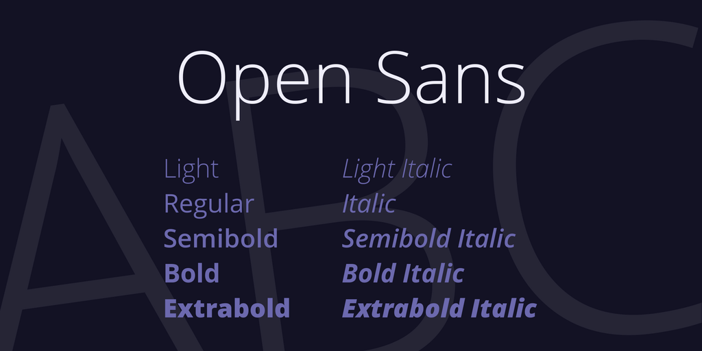
- Montserrat + Open Sans (combining two popular Google Fonts)
Accessibility Considerations
Ensure sufficient contrast between text and background colors. Aim for at least 4.5:1 contrast ratio for normal text and 3:1 for large text. Lighter weights require higher contrast to maintain readability.
Popular Use Cases
Montserrat excels in various design applications:
- Website Headers and Navigation: Its clean geometry makes it perfect for menus and headers
- Logo Design: Timeless elegance works well for brand identities
- Marketing Materials: Posters, flyers, and promotional graphics
- Editorial Design: Magazines, newspapers, and digital publications
- UI/UX Design: App interfaces and dashboard designs
- Presentations: Professional slides and business reports
Montserrat Alternates
For projects requiring slight variations, consider Montserrat Alternates, which features alternate character designs for certain letters. This variant offers a more traditional look while maintaining the same overall aesthetic and weights.
Performance Optimization Tips
When using Montserrat on websites, optimize for performance:
- Only load the font weights you actually use in your design
- Use font-display: swap to prevent invisible text during loading
- Consider using WOFF2 format for better compression
- Preload critical fonts to improve initial page rendering
- Subset fonts to include only necessary characters for your language
Conclusion
Montserrat font represents an excellent choice for designers seeking a versatile, elegant, and highly readable typeface. Its rich history, extensive font family, and free availability make it ideal for projects of any scale. Whether you're designing a website, creating a brand identity, or developing marketing materials, Montserrat provides the quality and flexibility you need.
With this guide, you now have all the knowledge necessary to download, install, and effectively use Montserrat in your design work. Its timeless geometric design ensures your projects will look professional and modern for years to come. Start experimenting with different weights and discover why Montserrat has become one of the most popular fonts in contemporary design.


.jpg)